A Brand New Look to Celebrate our 5th Birthday
LALA is growing from a high-potential startup to an at-scale continental force for prosperity. In the same way that our strategy has evolved over the years as our understanding of our students has deepened, we believe that our brand too needs to adapt to represent our community and the growth we aim for together with our community.
In 5 years, LALA has reached 1500+ students from 17 countries. We have accompanied our alumni to understand the crucial moments in their leadership journeys and tried to comprehend the highest-need interventions that are required to support them. Our intention through this process has been to adapt our Ecosystem to holistically support our young leaders by reducing the barriers they face.
LALA has become a community where individuals all over the world have come to find purpose, connection, and support. As our reach in Latin America gradually increases, we want to be intentional with our brand in order to make it welcoming to the world.
That’s why, today, we launch our new brand. Welcome (again) to LALA!
Why change?
Over the years that we have been building our legacy, our audience has identified us through different logos. Below, you can see its evolution.

However, none of those logos truly made us satisfied. They lacked something special and unique, which was revealed to us as we continued to develop our communications department last year. Finding our voice and tone quickly became a priority, and so did finding a new logo to call our own.
When our brand was first established, many elements came up naturally: our tagline, the Latin America map icon, and the care in our voice. But how did these elements interact with each other into creating a cohesive, powerful, and recognizable universe? The answer: they didn’t. They all somehow worked individually, but were not used strategically together. Although we were easily identified by our alumni and community members due to our work, the power of our brand wasn’t aligned with our visual identity—until now.
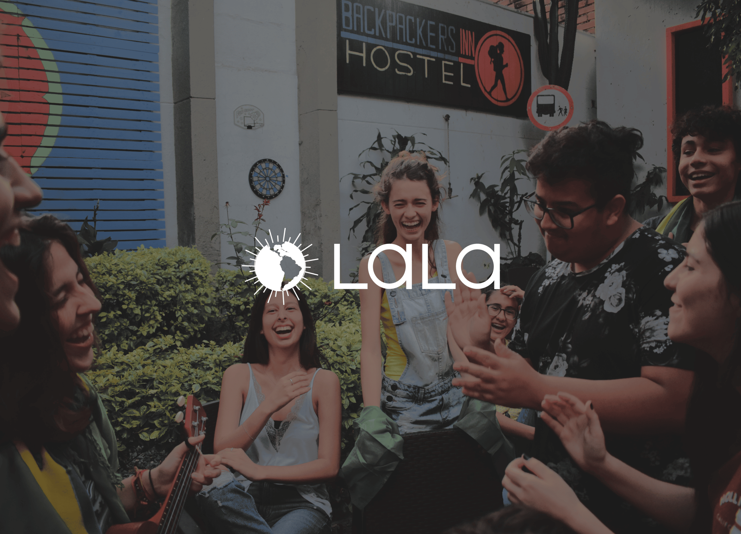
Our New Symbol
We are a Latin American organization that works in favor of Latin America. We tried getting inspiration for our mark from many different concepts: nature, llamas, community power, the universe. But no other symbol resonated more like LALA than the map of the region.
To bring a dull geographical item closer to the concept we had in mind, we decided to reenvision our dotted Latin America symbol as the sun.

We like this new mark because of a few reasons. Firstly, it allows us to immediately talk about our work without being too obvious; it is inviting without giving away too much information. Additionally, it is a good choice marketing-wise. Completely changing our symbol to something other than the region’s map could be a bold and dangerous move. We have been using the map for a long time to identify ourselves, so changing it to something completely new could confuse our audience and potentially erase all the efforts we have done in the past to establish our brand. Finally, we think it conveys positive messages associated with Latin America. We want our audience to think about energy, vitality, and the future when they look at our new brand, and we believe that this icon is a good depiction of that.
Also, we think it looks cute 😀
It’s all about “LALA”: The New Wordmark
Alongside our refresh LatAm symbol, we now introduce our new wordmark, which is just a design-y way to refer to the new font we are using to write “LALA”.
Deciding how to write the wordmark was challenging and definitely the part that we agonized the most over. “LALA” in all caps wrongfully conveys a bureaucratic and authoritarian feel, which we don’t like. On the other hand, “LALA” in title case just wouldn’t work because “LALA” is an acronym. So how could we write our organization’s acronym without conveying the wrong feeling while staying truth to its meaning? A possible solution came from looking at “LALA” beyond an acronym.
Over the years, our audience has associated us so much with “LALA” that it became an identity of its own. As a matter of fact, some of our staff members have reported that their relatives were surprised to learn after a year that “LALA” stands for “Latin American Leadership Academy”. This is also true when we think about the fact that “Latin American Leadership Academy” is quite of a mouthful. Everyone just refers to us as “LALA”, so we might as well embrace that as an official part of our brand.
We are the Latin American Leadership Academy, but “LALA” is an universal term that transcends languages and works pretty well in Portuguese, Spanish, and English. To capture such a feeling, we tried different iterations of the wordmark before landing on the layout that we believe captures this notion:

Mixcase Mixed is our most impactful typeface. Its playful yet modest curves can lend themselves well to functional headlines, marketing applications, and wayfinding. The lower-case A’s mixed with the upper-case L’s of the wordmark give autonomy for “LALA” to live on its own. Moreover, the round aspect of the typefont combined with its subtleness convey our playfulness in the right amount.
Colorways: Capturing Latin America as a Palette
Defining colors was also a tricky subject. For starters, consistency was our biggest challenge in comms efforts. The color mostly associated with LALA was a burgundy shade, which not only was zero consistent across our communications touchpoints but randomly evolved into a painful-to-look-at over-saturated red.
To reintroduce ourselves, we wanted to bring more energy to LALA by incorporating more bold and playful hues. We now present our primary palette: Atlantica, Escarlate, and Solaris. You will predominantly be seeing Solaris across our platforms since it is our main shade, but having three colors gives us an opportunity to expand and define our visual universe.


Atlantica, Escarlate, and Solaris are variations of colors that can be found across all flags in Latin America. They are just a bit more lively. A little bit brighter. And hopefully, a bit more LALA.

How did our community members help us define these changes?
The rebranding process was officially announced on our social media in April 2021. When figuring out our new look, we surveyed over 100 community members, hosted a logo submission contest and a virtual Design-a-Thon with 30 people participating, and held internal briefings with the LALA staff. We got your feedback and direction on style, colors, typography, and overarching brand feeling.
We are so grateful for your participation in this project. This was highly collaborative, so taking our time to listen to each and every opinion was essential to get us here.
Be the change. Lead the change

Our new brand is an evolution. It brings a new logo that can scale easily, and work better, in many more places, as well as a visual universe that is properly LALA.
Our tagline is still the same, but slightly more actionable: Be the change. Lead the change. We are excited to share this announcement with you today, and you will be seeing all of these new elements being used across our platforms.
With this new look, we hope to showcase who we are as an organization and community. We are, indeed, the same LALA; just hopefully more recognizable and consistent.

Our new look was crafted with your help, and we’d love your thoughts on how it turned out. Feel free to send us a DM, an email, or even a comment in this post. Your feedback is essential to our growth!
If you’d like to see more of our refreshed look in action, click the button below.
This post was written by LALA’s team member Pedro Borges.